Marketing / Typography / Print Design
Istation Print Materials
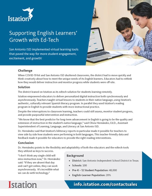
Over the course of 2022, I updated all of our print materials including brochures, one sheets, case studies and thought leadership materials.
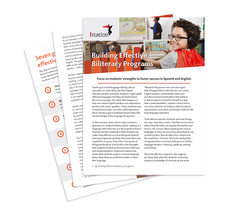
Marketing • Product Brochures • Branding • Project Manager
Brochure Project Goals
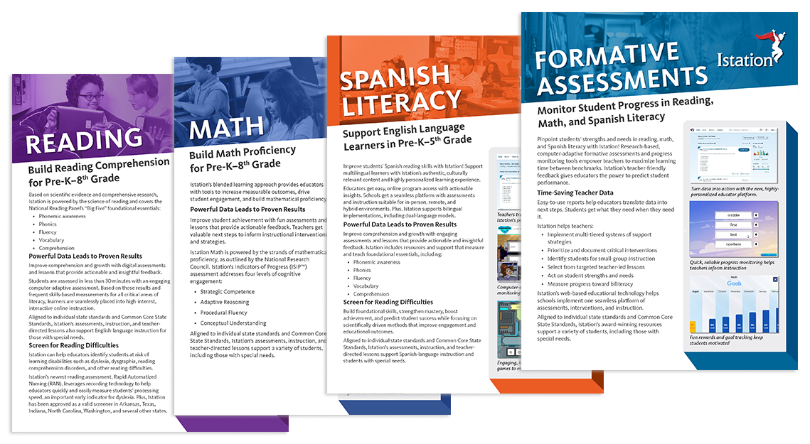
Create engaging layouts across the full lineup of promotional materials
Previous versions of one sheets, brochures and other print materials had a very uniform style across all media. However, there was little to differentiate between each product line and the marketing department set a goal to improve the performance of our newer products and increase upsell opportunities to our existing customers.
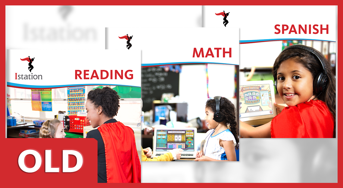
- The original brochures were very long with detailed information about the product. They also had dedicated cover pages and were printed on very high quality paper.
- Maintenance on these brochures was also difficult. Due to the diagrams, interface breakdowns and detailed product information in each brochure, anytime a minor change was made to the product, the brochures were out of date.
- Large lifestyle images that would take up a full page with no content or context.
- Each brochure cover had an identical design, and did not visually differentiating our newer math and spanish products enough from our reading product.
- While attractive in layout, the cost and complexity of these brochures were far higher than the benefit. Sales was wanting to address this issue while maintaining the high quality look and feel.
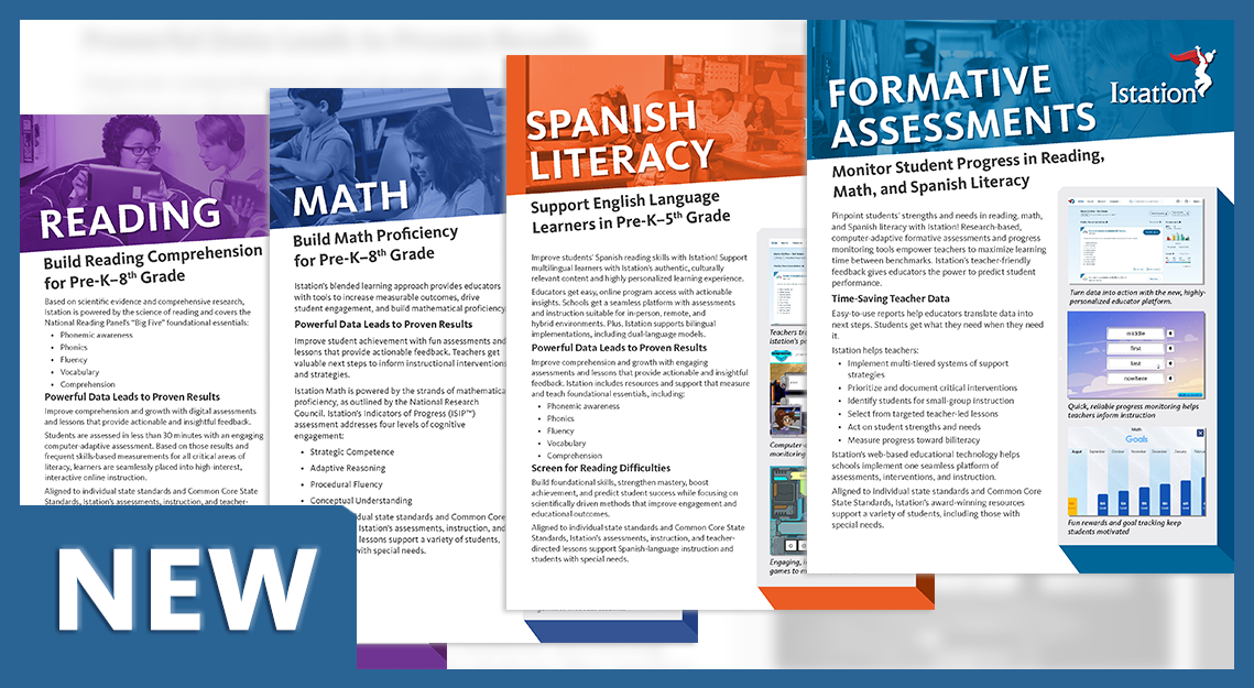
- Would go from approximately 24+ pages per brochure to only 6 pages. The paper quality was increased and these were designed as an oversized trifold on 11" x 25.5" paper.
- This gave the brochures a distinct look and feel, especially when fully open with the 3 page interior spread containing all of the most relevant product info.
- Would be easy to update once or twice a year as new products became available. The front page and first interior page of each brochure would draw attention to the most recent updates and features.
- Lifestyle images would remain present and large on the page but would live alongside the brochure copy.
- Each product brochure would use the same template layout but have it's own unique color scheme so that each one would be easier to differentiate quickly by a customer or sales rep.
- Most importantly, these would cost 1/5 the price per unit compared to previous brochures.
Marketing • Promotional Materials • Lead Generation • Project Manager
Promotional Materials
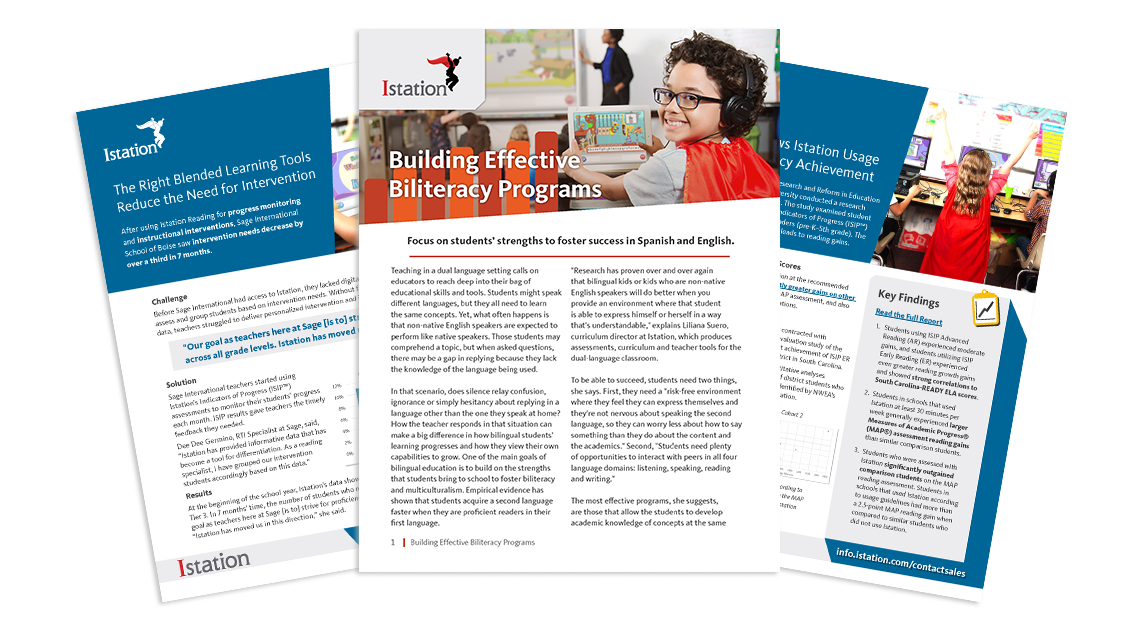
Case Studies, One Sheets, Playbooks and Other Print Collateral
With the reduced length of our revamped brochures, we made sure that our other print materials would fill in the gaps. An increased importance was placed on one sheets and playbooks to go into more detail on a specific subject, successful testimonial or product feature.
Playbooks
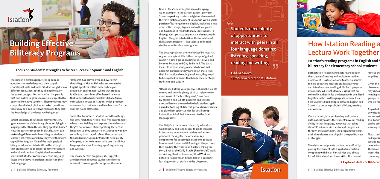
A new series of playbooks were written to serve initially as gated material but that could be made ungated as time went on. These would typically cover specific topics that were important to our users such as biliteracy or student intervention. Most playbooks were 4-6 pages.
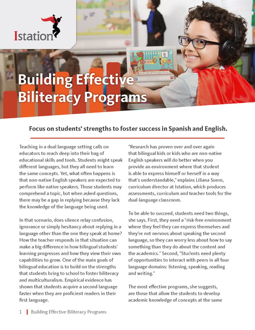
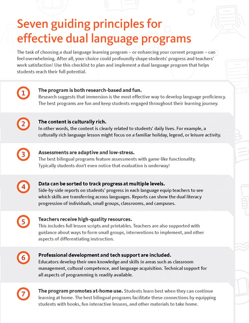
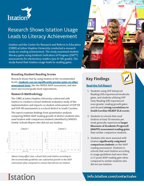
One Sheets and Case Studies
In order to highlight new product features, case studies or promote case studies, we developed a clean, versatile one sheet format that would be easy for a rep to print off or share with a customer via e-mail. And of course, these would be highlighted as ungated content from the Istation home page.
Senior Graphic Designer • Website Designer • UI/UX Designer • Project Manager
Key Improvements
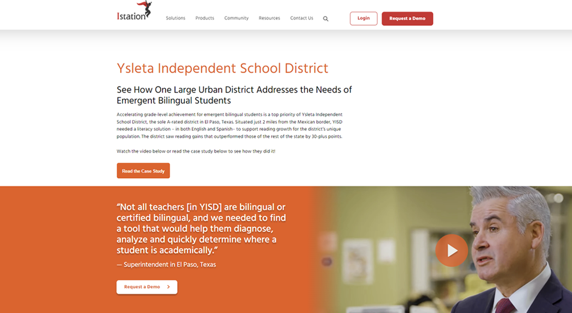
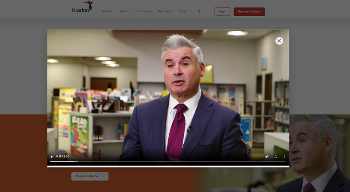
engaging testimonials
Our customers loved to tell their stories, and we wanted to showcase their success all throughout the site. I came up with the concept of a 3-in-one module that was a pull quote, video testimonial and call to action. The module could utilize as three elements or only one of them.
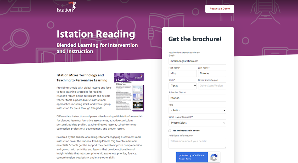
More substantial Landing Pages
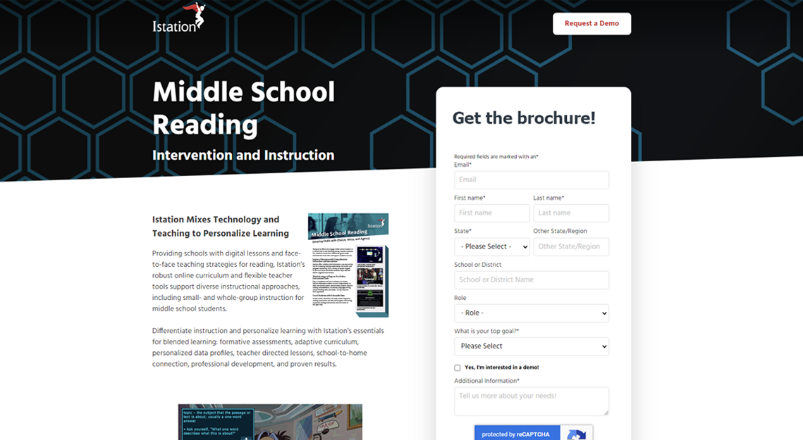
Our previous landing pages were very bare bones, typically with a title, a subhead and some type of image. In the past this minimal approach worked well for us, but in recent years customers were less likely to engage. We wanted to provide a bit more information on every landing page about why someone should engage with us and download the one sheet, brochure, or sign up for a study.
However, there would be no links to outside pages, since we wanted to keep an opportunity on the landing page. And the form would be large and easy to access at all times.
Expanded Ungated Content
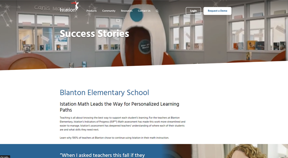
Broad, top of funnel content such as success stories or case studies was set up to be provided ungated from our home page. These were usually presented in video, blog or PDF format. After viewing this ungated content, the visitor would be guided through CTAs to additional pages that might contain gated content such as a brochure, webinar or playbook.
Location:
Golden, CO
(c) 2026 Michael Wade Malone. All Rights Reserved.


