Illustration / Social Media / Engagement
Istation
Social Media
Being an educational software company with a variety of great characters, creating graphics for Istation's social media to engage with teachers, parents and students was a blast!
Marketing • Illustration • Social Media • Engagement
Social Media Goals
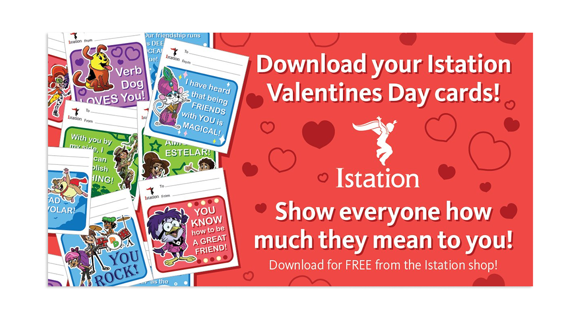
Social Media Posts that appeal to Multiple Audiences
The marketing content and design teams worked closely together on social campaigns that appealed to multiple audiences. LinkedIn in particular housed more of our professional contacts (press releases, upcoming webinars, whitepapers). These posts would feature more lifestyle images and simple designs that matched with our primary marketing materials.
Meanwhile, our Twitter (X) and Facebook followers tended to have a higher concentration of teachers, parents and students. These placed a higher emphasis on fun engagement and the product characters.
PowerPath Launch Campaign
During the 2020-2021 year, Istation launched a new interface that was meant to incentivize student engagement with the program while learning from home. While the marketing campaign was multi-faceted, the social campaign focused on getting the word out about the new features to parents and students.
Company Announcements and Community Engagement
Not every campaign was tied to a major product update or launch. The marketing department also regularly took the take the time to celebrate the employees and teachers that made Istation so successful over the years.
New Educator Platform Campaign
As Istation rolled out a new and improved educator platform in 2022, our promotional campaign focused heavily on the platform being built by educators, for educators. We took regular feedback from teachers at every stage of development and wanted to make it known that their voice made a difference.
Holiday Posts
Throughout the year, Istation we would celebrate major holidays by having our characters and staff send out greetings. We would also often have free giveaways such as printable masks for Halloween, greeting cards for Valentine's Day and printable bookmarks for National Reading Day.
Senior Graphic Designer • Website Designer • UI/UX Designer • Project Manager
Key Improvements
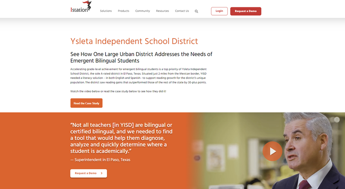
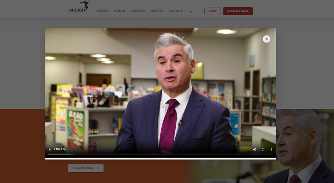
engaging testimonials
Our customers loved to tell their stories, and we wanted to showcase their success all throughout the site. I came up with the concept of a 3-in-one module that was a pull quote, video testimonial and call to action. The module could utilize as three elements or only one of them.
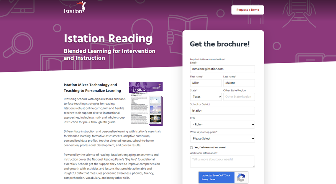
More substantial Landing Pages
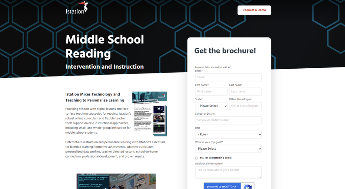
Our previous landing pages were very bare bones, typically with a title, a subhead and some type of image. In the past this minimal approach worked well for us, but in recent years customers were less likely to engage. We wanted to provide a bit more information on every landing page about why someone should engage with us and download the one sheet, brochure, or sign up for a study.
However, there would be no links to outside pages, since we wanted to keep an opportunity on the landing page. And the form would be large and easy to access at all times.
Expanded Ungated Content
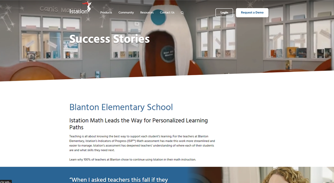
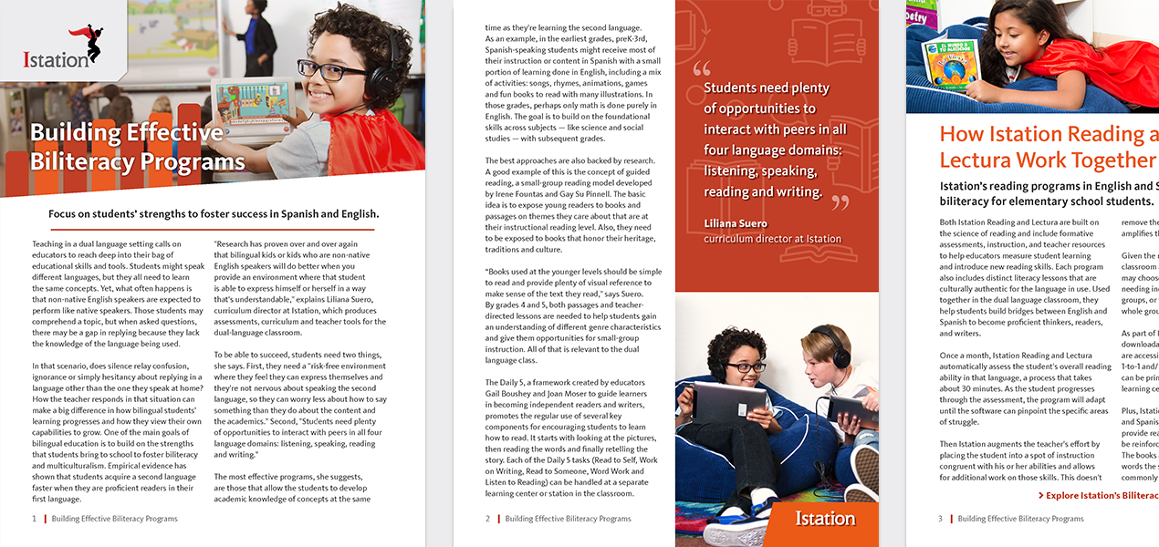
Broad, top of funnel content such as success stories or case studies was set up to be provided ungated from our home page. These were usually presented in video, blog or PDF format. After viewing this ungated content, the visitor would be guided through CTAs to additional pages that might contain gated content such as a brochure, webinar or playbook.
Location:
Golden, CO
(c) 2026 Michael Wade Malone. All Rights Reserved.
