Illustration / Product Development / Packaging
Istation
Promotional Items
Over the years I had a great number of opportunities to design cool products, packaging and printables for our company store.
Promotional Items • Illustration • Product Development • Packaging
Istation Store Goals
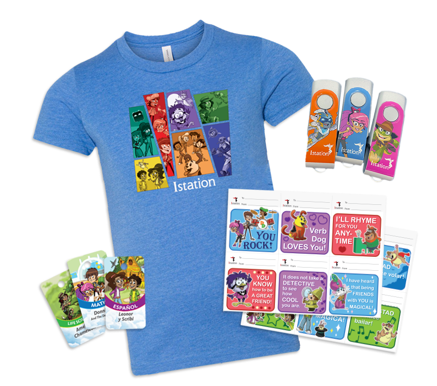
A fun collection of items for employees, educators and students
While our product characters did not typically appear front and center in marketing materials, the collection of promotional items available in the Istation store focused far more on them. This is because most of the items were used as giveaways for teachers and students or at industry events.
Our employees also loved to show their Istation pride with office supplies or apparel.
Celebration Box
In 2021 we launched a new product aimed at sales reps and teachers called the Celebration Box. This product contained a variety of our most popular Istation products such as posters, kids in cape pencils, coozies, brag tags, stickers, puppets and more! We updated the boxes regularly with new promotional items. Most of these promotional items, as well as the celebration box, were designed by myself.

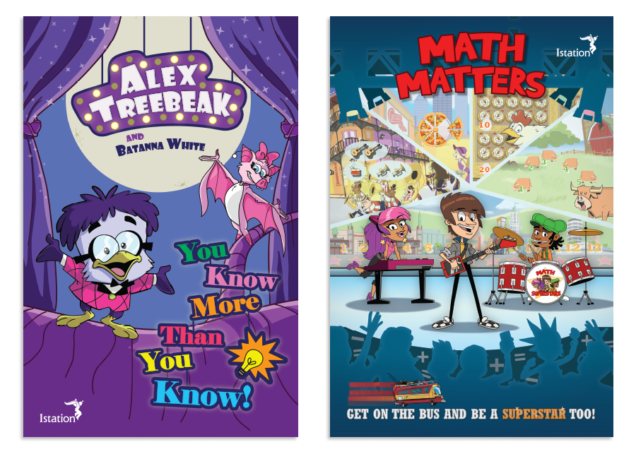
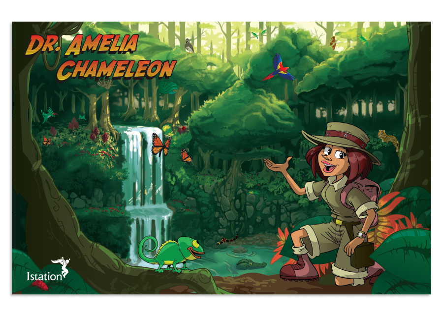
Product Posters
When remodeling our offices, I created a series of large movie poster sized images based on our product line. When these were received positively by visitors and employees, I re-designed and printed a set of smaller 11x17 versions of each poster to be sold in sets on the Istation store.
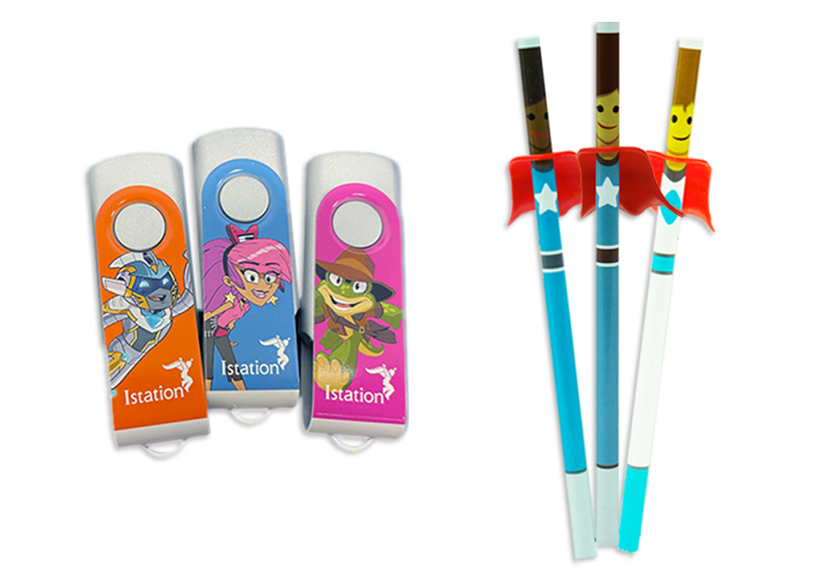
Swag and Treasure Box Items
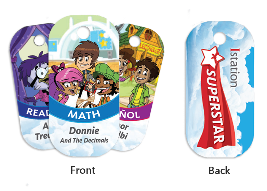
Over the years I created a number of fun items specifically designed to be used as event swag or treasure box items for kids. The USB sticks, superhero pencils and brag tags were some of the most popular items over the years.
Senior Graphic Designer • Website Designer • UI/UX Designer • Project Manager
Key Improvements
engaging testimonials
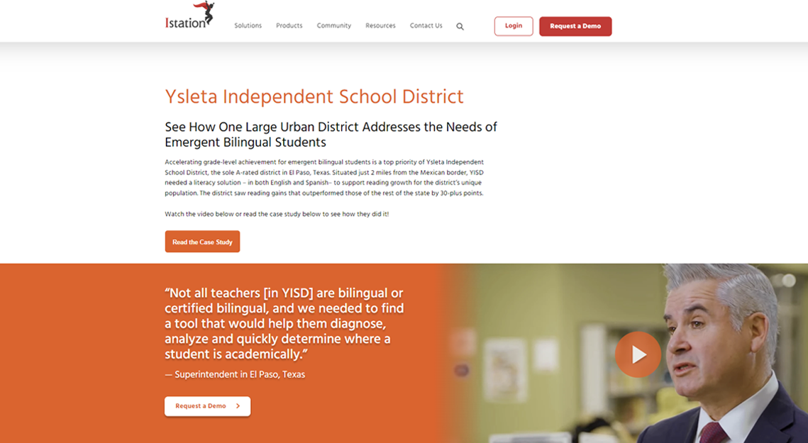
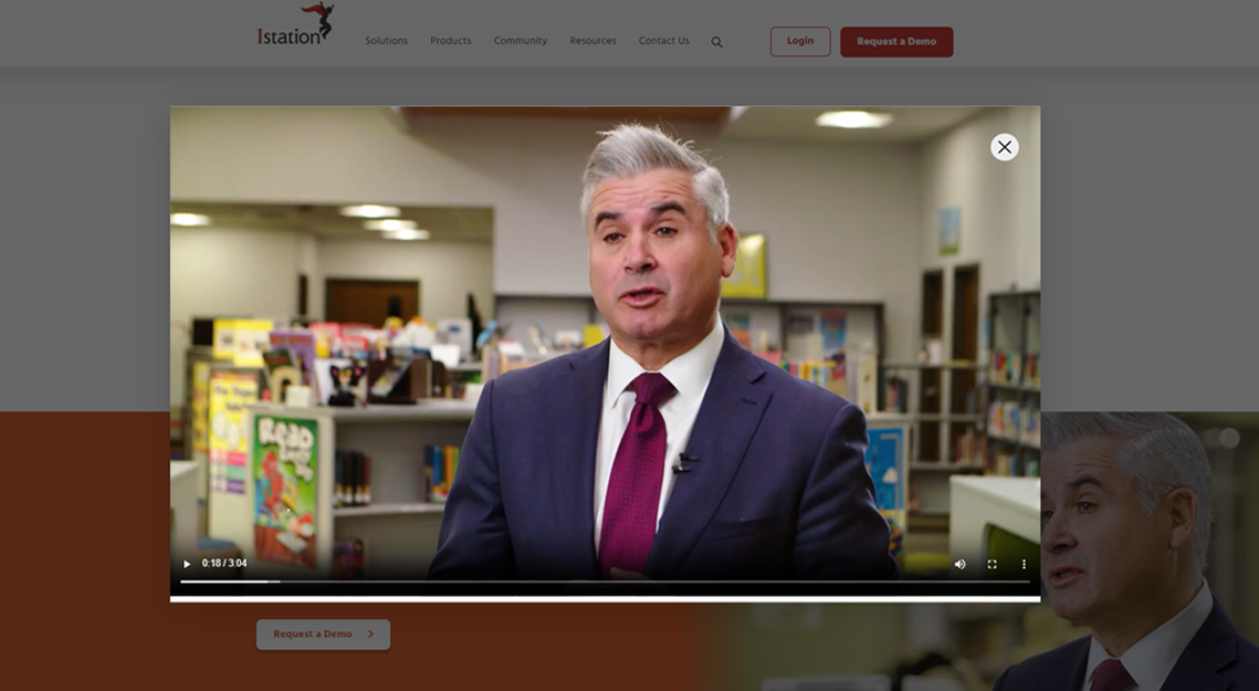
Our customers loved to tell their stories, and we wanted to showcase their success all throughout the site. I came up with the concept of a 3-in-one module that was a pull quote, video testimonial and call to action. The module could utilize as three elements or only one of them.
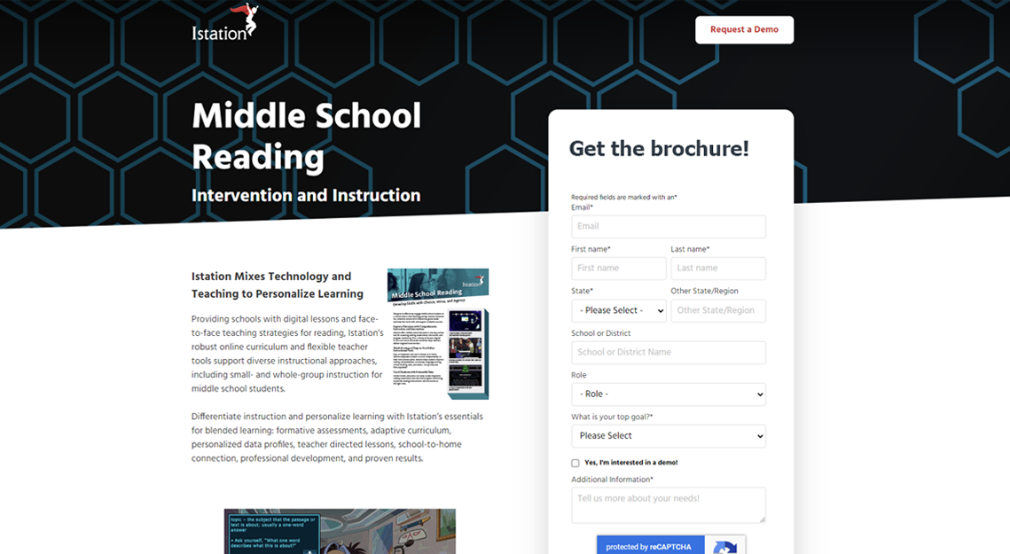
More substantial Landing Pages
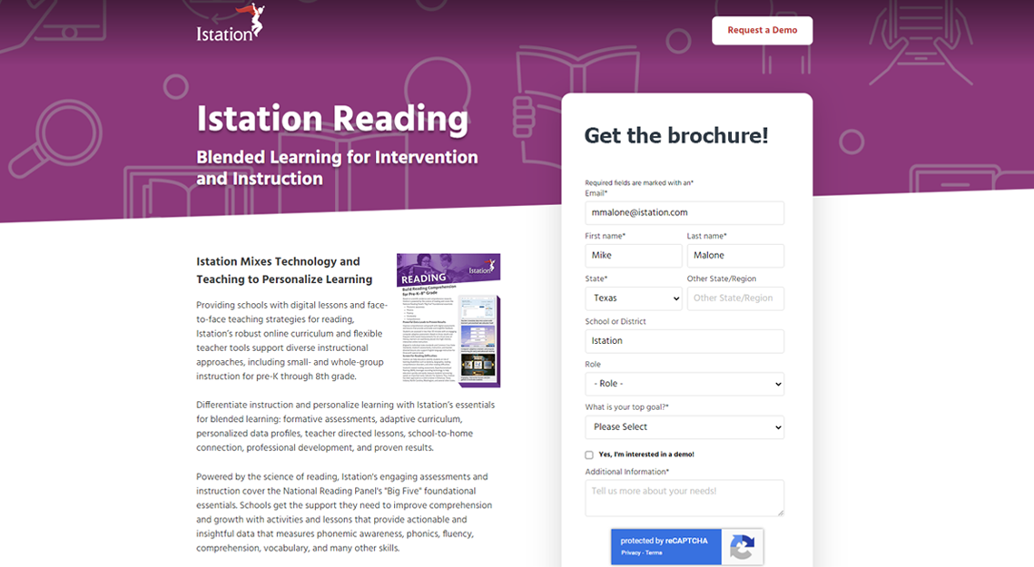
Our previous landing pages were very bare bones, typically with a title, a subhead and some type of image. In the past this minimal approach worked well for us, but in recent years customers were less likely to engage. We wanted to provide a bit more information on every landing page about why someone should engage with us and download the one sheet, brochure, or sign up for a study.
However, there would be no links to outside pages, since we wanted to keep an opportunity on the landing page. And the form would be large and easy to access at all times.
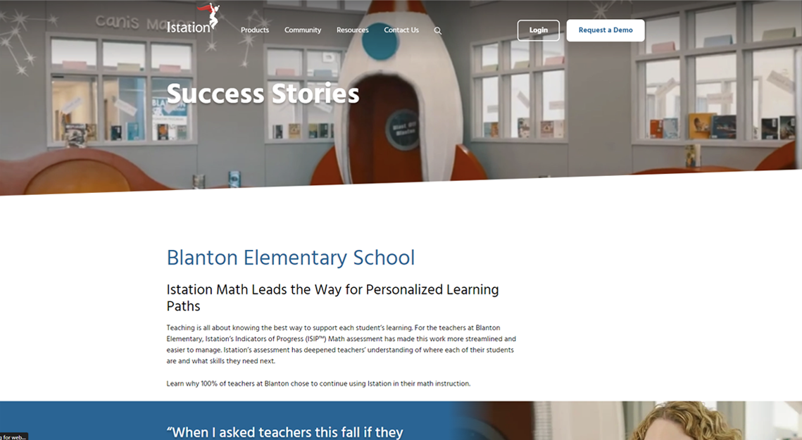
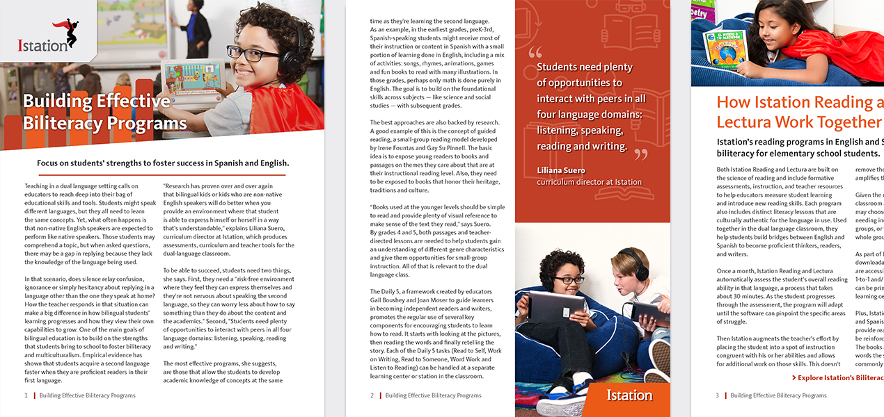
Expanded Ungated Content
Broad, top of funnel content such as success stories or case studies was set up to be provided ungated from our home page. These were usually presented in video, blog or PDF format. After viewing this ungated content, the visitor would be guided through CTAs to additional pages that might contain gated content such as a brochure, webinar or playbook.
Location:
Golden, CO
(c) 2026 Michael Wade Malone. All Rights Reserved.
