Web Development / UI / UX Design
Istation Website Refresh
Updating the home page to modern standards for user experience and accessibility while improving lead generation and upsell opportunities.
Senior Graphic Designer • Website Designer • UI/UX Designer • Project Manager
Project Goals

Improve The Customer Experience and Increase Potential Opportunities
Previously, Istation.com was maintained by the engineering team, making site updates difficult. The engineering team's focus was always on the product and working on the home page took time away from that.
So in 2021 Marketing proposed that we rebuild the site within Hubspot and take over the daily operations. This would not only reduce the work on the engineering team, but would give Marketing the opportunity to improve the useability, accessibility, site performance and lead generation opportunities.
Due to my previous experience with website development, I was tasked with proposing the changes to upper management and leading this transition to Hubspot.

After exploring the previous version of the site over a few weeks, we identified issues that we wanted to address. Some of these major points were:
- The IT team needed to have the burden lifted from them and the marketing department needed to have access to website updates.
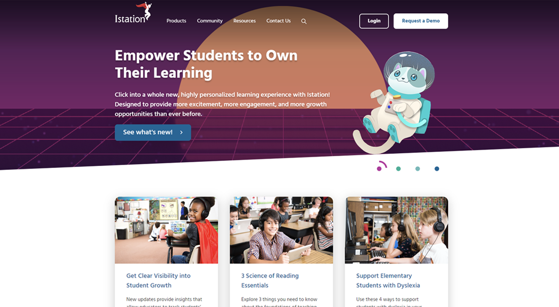
- The home page was not useful, containing very little information about our product. A large silent video filled the screen above the fold, causing the page to be slow to load.
- The home page had no way to easily inform customers about recent product updates or important notifications. Only simple text banners were updated frequently.
- Site layout was out of date with large video or lifestyle images above the fold and little to no content immediately visible.
- Navigation was out of date as our lineup had grown to accompany more products than just 'Reading, Math and Spanish'.
- There were few opportunities to inform potential customers about our products or gather information about them. There were few upsell opportunities for existing customers.

In order to address these issues, I spent several weeks in conjunction with the UI/UX team and product teams to come up with a new site concept:
- The site would now live on Hubspot which makes for easier site updates.
- Homepage would have a rotating carrusel to showcase our products services, and recent updates.
- Lifestyle images would remain but be reduced in size so that content was not pushed down below the fold.
- We would have a section dedicated to resources and solutions including blog posts, one sheets, research, etc which we could change out regularly.
- The navigation was streamlined to accommodate future product growth.
- A 'Request a Demo' button was now present on every page so that at any time, a potential customer could reach out to the sales and marketing team for more information on a specific product.
Senior Graphic Designer • Website Designer • UI/UX Designer • Project Manager
Key Improvements


engaging testimonials
Our customers loved to tell their stories, and we wanted to showcase their success all throughout the site. I came up with the concept of a 3-in-one module that was a pull quote, video testimonial and call to action. The module could utilize as three elements or only one of them.


More substantial Landing Pages
Our previous landing pages were very bare bones, typically with a title, a subhead and some type of image. In the past this minimal approach worked well for us, but in recent years customers were less likely to engage. We wanted to provide a bit more information on every landing page about why someone should engage with us and download the one sheet, brochure, or sign up for a study.
However, there would be no links to outside pages, since we wanted to keep an opportunity on the landing page. And the form would be large and easy to access at all times.


Expanded Ungated Content
Broad, top of funnel content such as success stories or case studies was set up to be provided ungated from our home page. These were usually presented in video, blog or PDF format. After viewing this ungated content, the visitor would be guided through CTAs to additional pages that might contain gated content such as a brochure, webinar or playbook.
Location:
Golden, CO
(c) 2026 Michael Wade Malone. All Rights Reserved.